
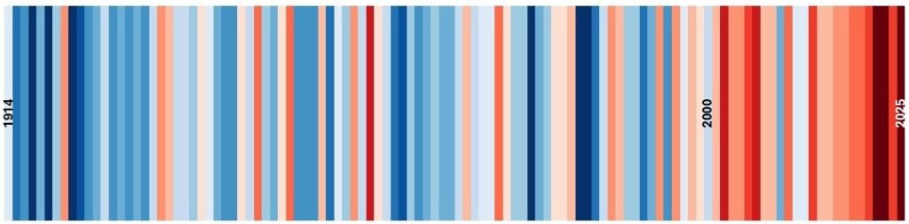
The picture below shows the annual average1 temperature for Eskdalemuir2 in Scotland. Each vertical stripe represents one year from 1914 on the left to 2025 on the right. Blue stripes are relatively cold years and reds are the hot ones.
Notice that it’s mostly blue before 2000 and mostly red after that. Nine of the ten hottest years ever recorded at Eskdalemuir were in the years since 2000.
The same pattern recurs for the vast majority of weather stations on Earth. Over 96% of them warmed in the last few decades.
You can check this yourself on the “show your stripes” website which has temperature stripes for hundreds of places across the World going back, in many cases, centuries. You’ll be hard-pressed to find places that do not show a pattern like the one above for Eskdalemuir!
If almost every weather station on Earth shows warming over the last few decades, it’s hard to argue that climate change is not happening.